
Sourcebook - Jazz-Riffs Design Library
Series Nine: Taking the Idea of Hardware as Part of the Interior Composition a Step Further I'm showing it my concept.
Home > Sourcebook > Jazz-Riffs Design Library > White Papers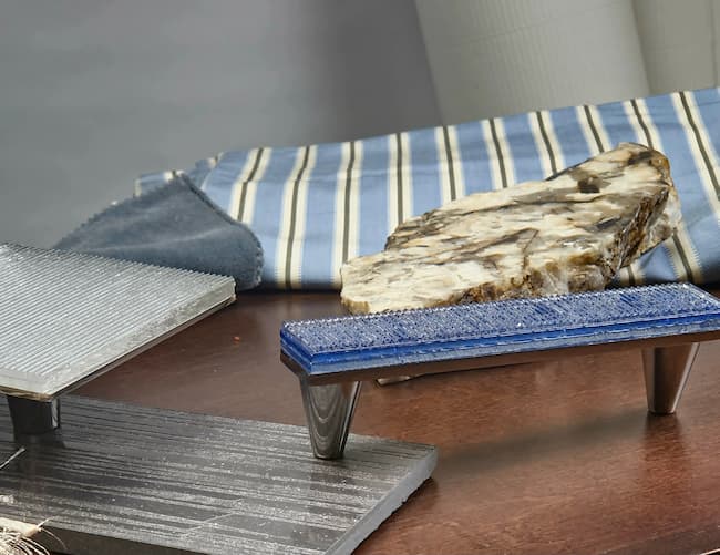
Series Nine: Taking the Idea of Hardware as Part of the Interior Composition a Step Further I'm showing it my concept.
When should decorative hardware be selected?
Some say hardware should be considered at the very beginning of the design process. Others believe it should be selected after the cabinetry has been designed, coordinating it with the cabinet finish. And still others choose hardware to match the metal finish of the kitchen faucet, lighting, or other fixtures within the space.
It depends on how you develop your interior concept and what you want the details of that interior to say.
Do you want the architectural details to create drama and give the composition a little punch? Or do you want those details to quietly blend into the materials, colors, and textures surrounding them?
That is the thinking behind Jazz & Riffs Hardware Collection.
As an interior designer, I have always looked at hardware as an architectural detail — another material within the composition, rather than something that is simply added after the design is completed.
For me, it often works within my three-color rule of design. Depending on the interior and the client's needs, hardware can introduce an additional point of color, reinforce a color already within the concept, or quietly connect several materials within the space.
Our Jazz glass collection can bring that desirable point of attraction to cabinetry — the detail that draws your eye and gives the composition another layer.
The linear, stacked texture of Jazz interacts with light and allows the glass to become more than a cabinet pull or knob. It becomes a small piece of functional art within the interior.
Or is it the softer, flowing texture like our Riffs glass collection brings a different character to an interior. Rather than demanding attention, Riffs can create a sense of serenity and quietness within the composition.
Its texture can blend with the surrounding materials while still giving the cabinetry an architectural detail of its own.
Choose one of our 11 curated colors to relate to a color already within the concept — cabinetry, stone, tile, wall covering, upholstery, artwork, or another material — and allow the hardware to become part of that visual relationship.
That is what makes color so important to the Jazz & Riffs collection.
Our palette was developed to work across a broad range of interior tones and concepts, giving designers the ability to decide whether the hardware should contrast, complement, or quietly blend.
Here in my color concept composition I'm featuring the 2 tones of color glass both in the riffs collection because I want the room to work together in a common play of color and texture not making one stand out from the other. And also working with my and every designers 3 color rule of interior design. I get into those rules of design in my next article.
Here in this concept the I'm playing with the a walnut wood and with it a the tones of blue and grey tile tone but instead of added strong grey or black tone to the walnut wood cabinets I'm softening them with a combination clear and blue tones to make the texture make the concept flow through the room with tight weave and soft plush textured fabrics I selected our clear square glass for the upper cabinets and our Bombay blue Long pulls for the all cabinets below the counter the stone top is Tiger Eyes granite a mix of creamy white, black and brown tones. The over all feeling in the space is warm masculine and harmony
You can mix and match colors and textures together to bring that feeling of softening with the glass it adds the shimmer soft sparkle to make a kitchen feel together with its stainless steel appliances and polished faucets light fixtures can be clear glass chandeliers with a little color of blue them your play list can work in harmony .
Jazz & Riffs Hardware Collection — Architectural Jewelry for the Interior.
Some say hardware should be considered at the very beginning of the design process. Others believe it should be selected after the cabinetry has been designed, coordinating it with the cabinet finish. And still others choose hardware to match the metal finish of the kitchen faucet, lighting, or other fixtures within the space.
It depends on how you develop your interior concept and what you want the details of that interior to say.
Do you want the architectural details to create drama and give the composition a little punch? Or do you want those details to quietly blend into the materials, colors, and textures surrounding them?
That is the thinking behind Jazz & Riffs Hardware Collection.
As an interior designer, I have always looked at hardware as an architectural detail — another material within the composition, rather than something that is simply added after the design is completed.
For me, it often works within my three-color rule of design. Depending on the interior and the client's needs, hardware can introduce an additional point of color, reinforce a color already within the concept, or quietly connect several materials within the space.
Our Jazz glass collection can bring that desirable point of attraction to cabinetry — the detail that draws your eye and gives the composition another layer.
The linear, stacked texture of Jazz interacts with light and allows the glass to become more than a cabinet pull or knob. It becomes a small piece of functional art within the interior.
Or is it the softer, flowing texture like our Riffs glass collection brings a different character to an interior. Rather than demanding attention, Riffs can create a sense of serenity and quietness within the composition.
Its texture can blend with the surrounding materials while still giving the cabinetry an architectural detail of its own.
Choose one of our 11 curated colors to relate to a color already within the concept — cabinetry, stone, tile, wall covering, upholstery, artwork, or another material — and allow the hardware to become part of that visual relationship.
That is what makes color so important to the Jazz & Riffs collection.
Our palette was developed to work across a broad range of interior tones and concepts, giving designers the ability to decide whether the hardware should contrast, complement, or quietly blend.
Here in my color concept composition I'm featuring the 2 tones of color glass both in the riffs collection because I want the room to work together in a common play of color and texture not making one stand out from the other. And also working with my and every designers 3 color rule of interior design. I get into those rules of design in my next article.
Here in this concept the I'm playing with the a walnut wood and with it a the tones of blue and grey tile tone but instead of added strong grey or black tone to the walnut wood cabinets I'm softening them with a combination clear and blue tones to make the texture make the concept flow through the room with tight weave and soft plush textured fabrics I selected our clear square glass for the upper cabinets and our Bombay blue Long pulls for the all cabinets below the counter the stone top is Tiger Eyes granite a mix of creamy white, black and brown tones. The over all feeling in the space is warm masculine and harmony
You can mix and match colors and textures together to bring that feeling of softening with the glass it adds the shimmer soft sparkle to make a kitchen feel together with its stainless steel appliances and polished faucets light fixtures can be clear glass chandeliers with a little color of blue them your play list can work in harmony .
Jazz & Riffs Hardware Collection — Architectural Jewelry for the Interior.